
K-Pop Music Videos Is My Architecture Escape...
Reviewed by R. K.

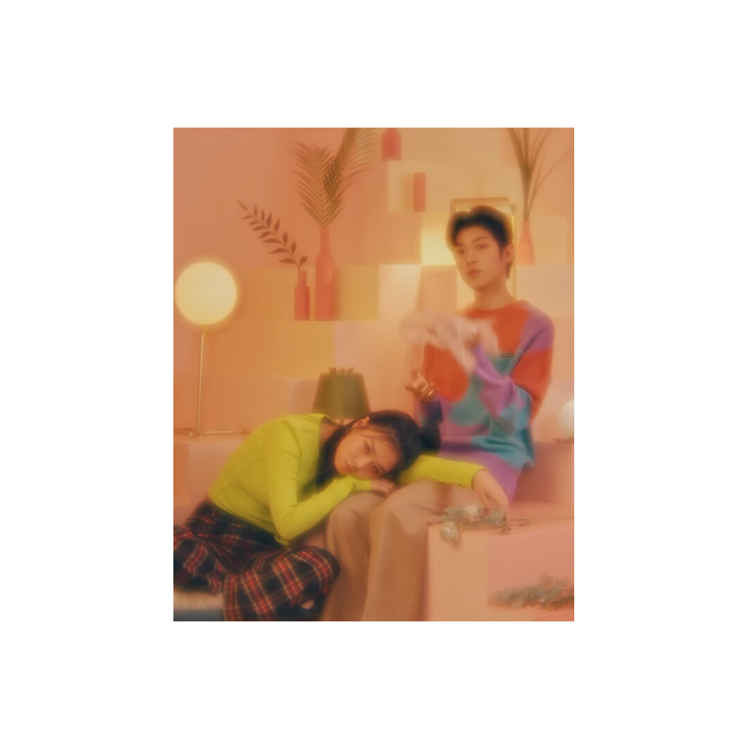
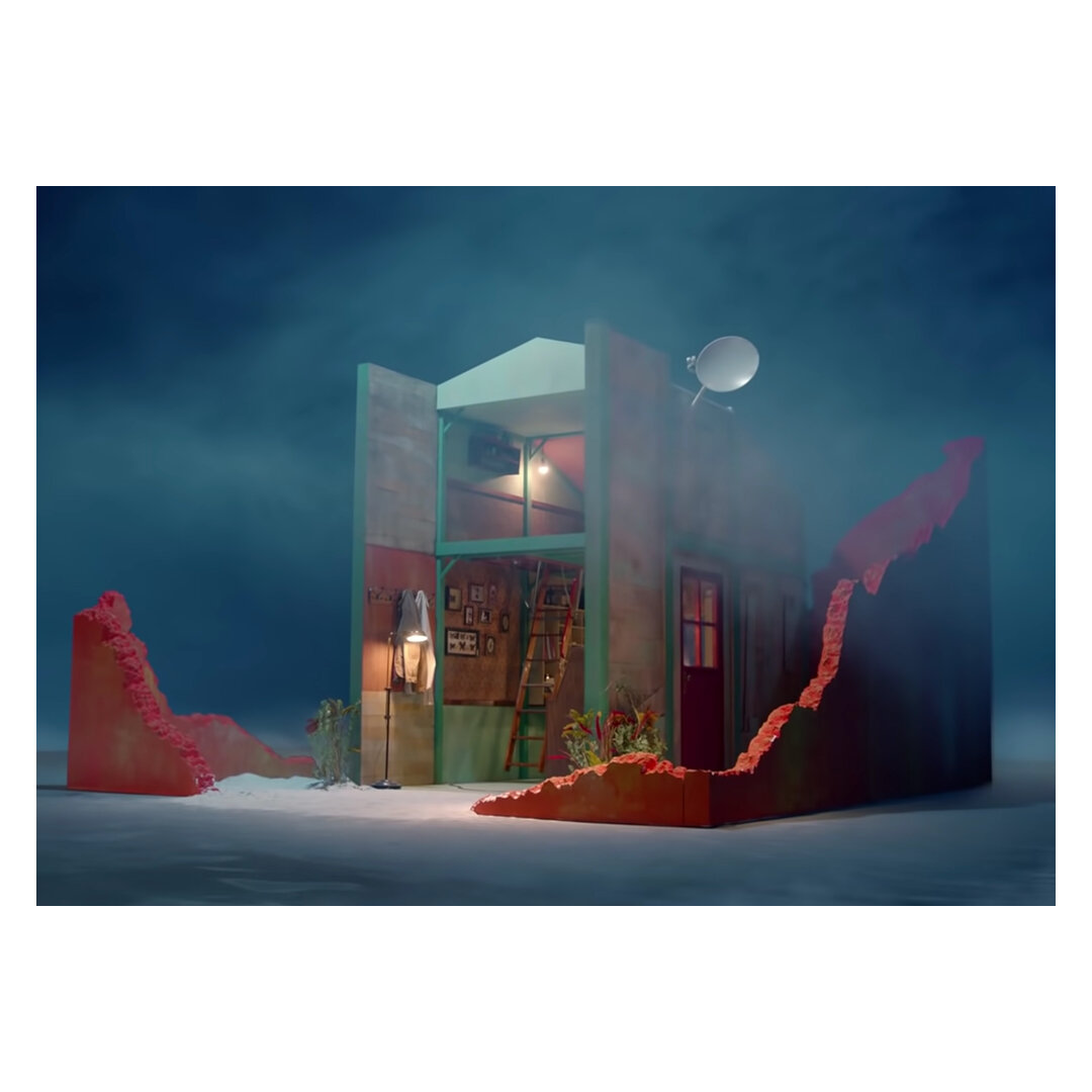
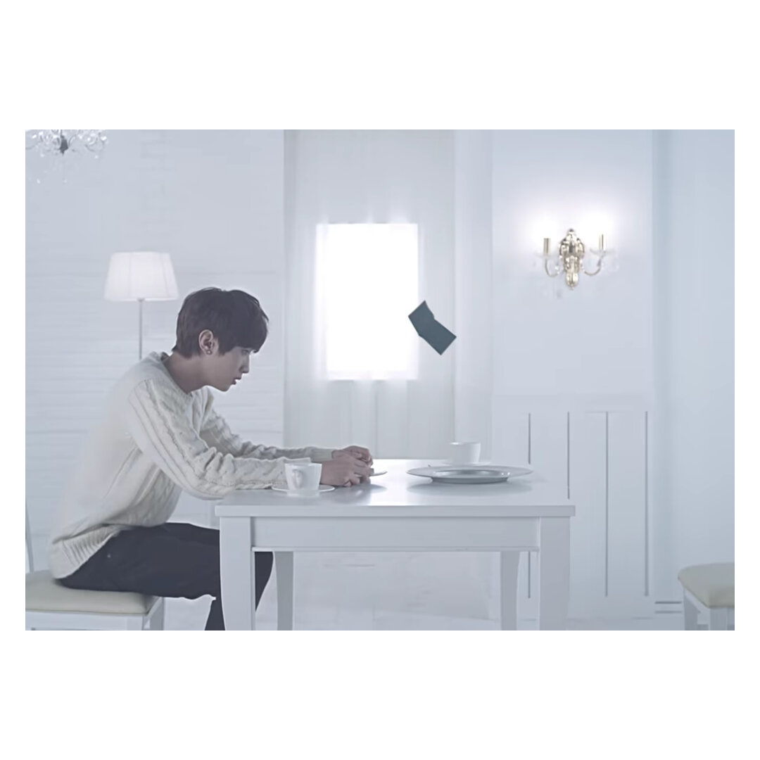
Red Velvet, Dumb Dumb (2015)
In an industry that heavily depends on visuals, aesthetics and appearances, it would be an understatement to say that Korean Pop Music (aka K-Pop) industry is very extra. Although I’m not a hardcore enthusiast of the K-Pop music franchise, I still find myself drawn to their efforts. There have been many times when dinner table conversations at a Korean restaurant have been interrupted by captivating images of music videos on the television hanging by the corner. K-Pop somehow embodies some of those fantastical elements that may be kitsch yet enticing. Not to mention, the ensemble of staging, storyline and styling has offered a window of escape into an alternative form of architecture appreciation when I need a break from reality.
And so, I thought it would be fitting to highlight some of my favourite music K-Pop music videos that I enjoy revisiting for various reasons.
I watch it because I enjoy the colour schemes…

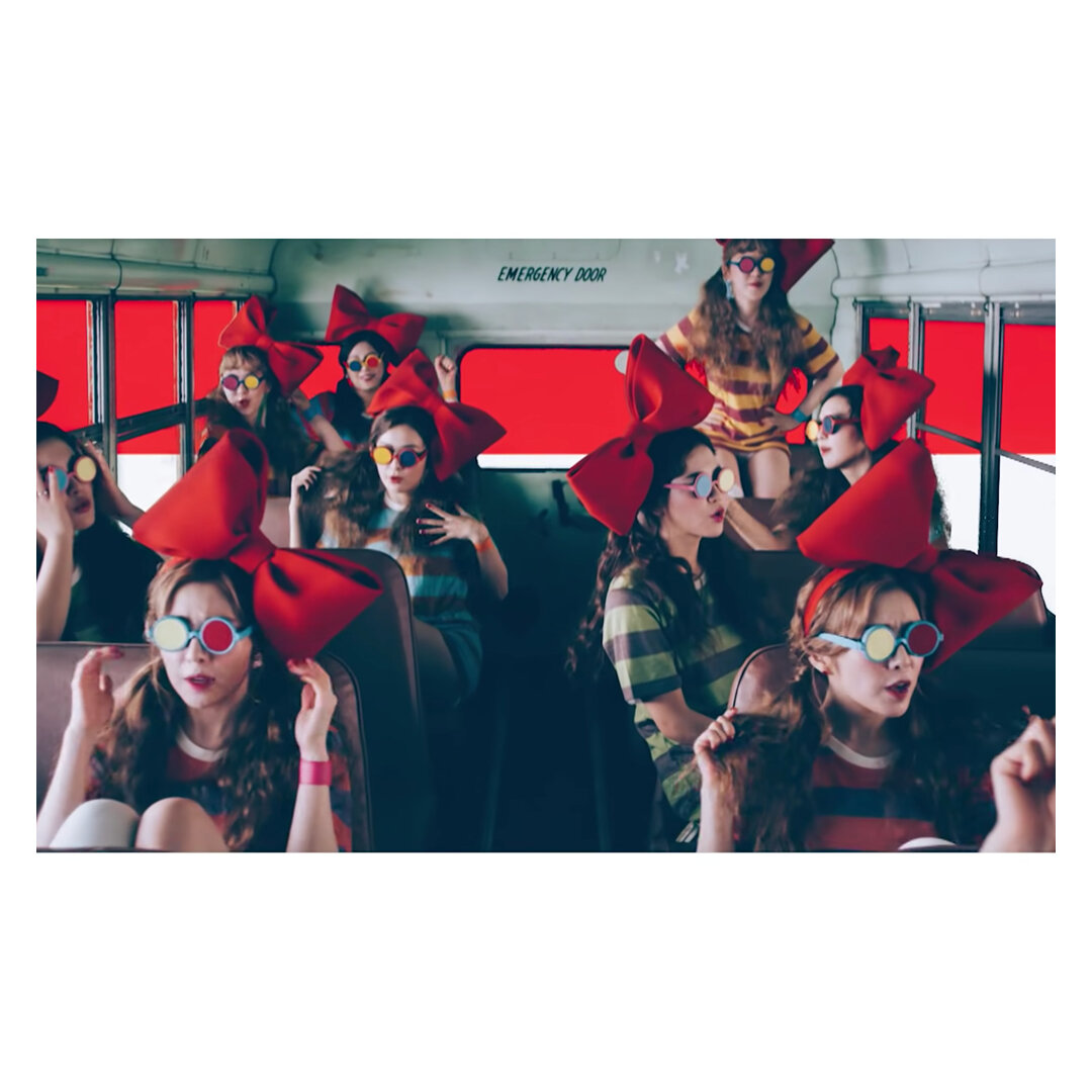

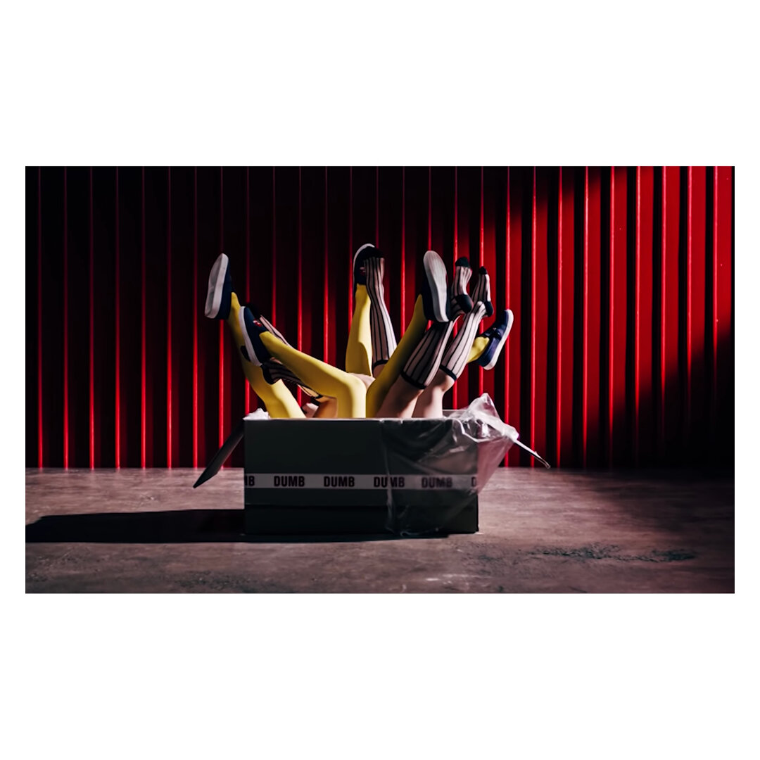


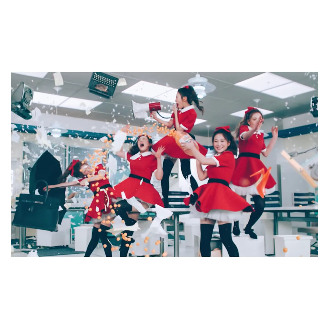

Red Velvet’s Dumb Dumb (2013) is one of my favourite introduction videos to the K-Pop industry. Watching singers’ dancing to an upbeat tempo and act robotically against a pastel gothic 70’s office-manufacturing backdrop is arresting. The selling point of the video is the number of colour schemes (such as cool blues and greens otherwise plum reds and mustards) that can be extracted from each frame. This video to me still holds one of my favourite colour schemes to date, and very addictive to watch.
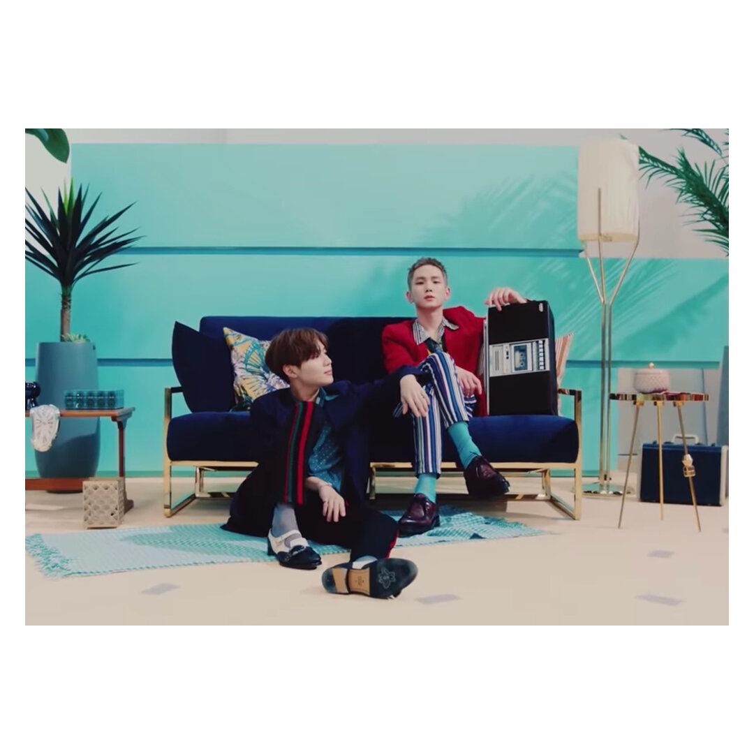

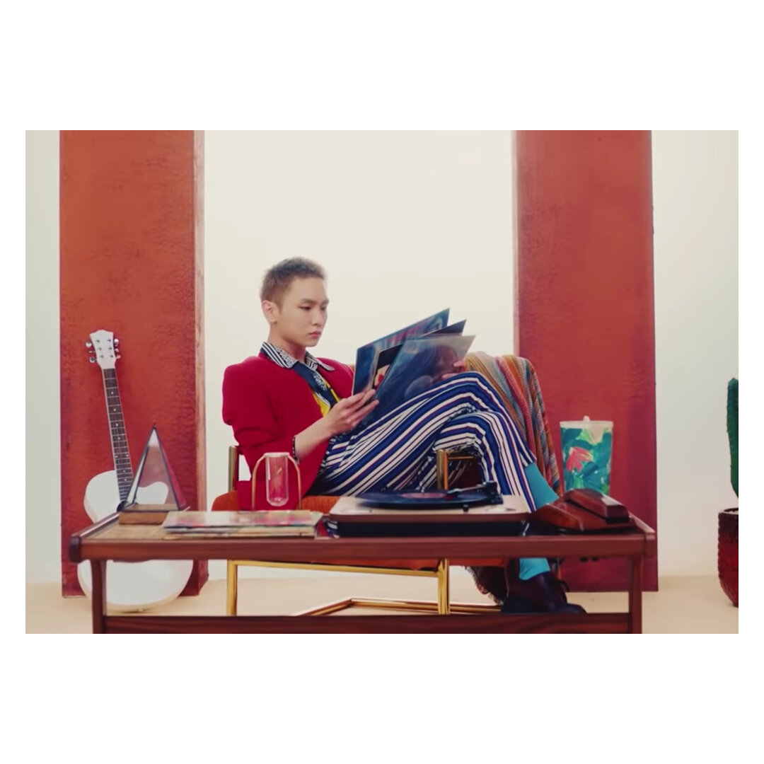

For brighter pastels, SHINee’s Countless (2018) is a great go-to. A departure from their electric vibe, the music video is laid back and relaxed. Each member is framed with unique colour combinations. The video doesn’t present a narrative, but offered distilled moments. Those who are aware of the recent news of SHINee would identify the undertone of sadness in the song. However, the combination of the mellowed rhythm and evocative use of colours in the video provides a hopeful message of their future ambitions.


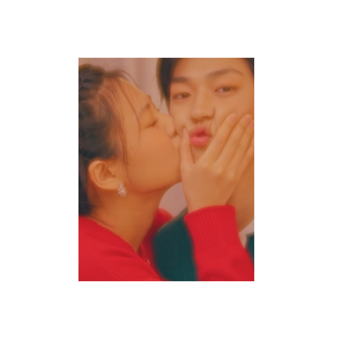

Comparatively speaking, I find Bibi’s Restless (2020) is the epitome of balancing the oversaturation of monochromatic schemes. A video that I’d like to describe as the perfect summary of what it is like to fall in love, Restless douses the screen in millennial pink and hues of rose gold. The cinematography takes advantage of the misting filter, enhancing the singer’s rose-coloured glasses of their love interest. Despite the overwhelming wash of pink, the video excels in capturing the audience’s attention through sprinkling complimentary greens and reds of the characters, and intense closeups of the intimate couple.
Generally speaking - because it can indicate the mood and characterisation of the narrative, the colour scheme is a crucial yet effective strategy. Whether it’s bold brights, dreamy pastels or overwhelming neons - our attention is still drawn to them.
2. I watch it because I want to know what happens in the story…
As a lover for storytelling in architecture, I enjoy analysing how the stage sets have been designed for the video. I don’t speak Korean, and so I depend on the video and the singers’ interactions with the built fantastical environment to provide the summary.
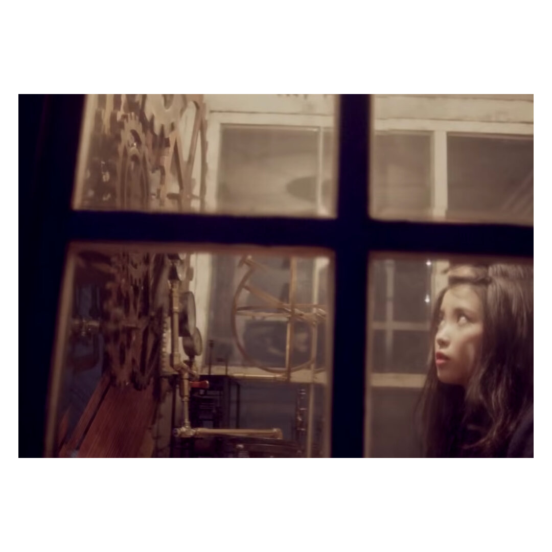
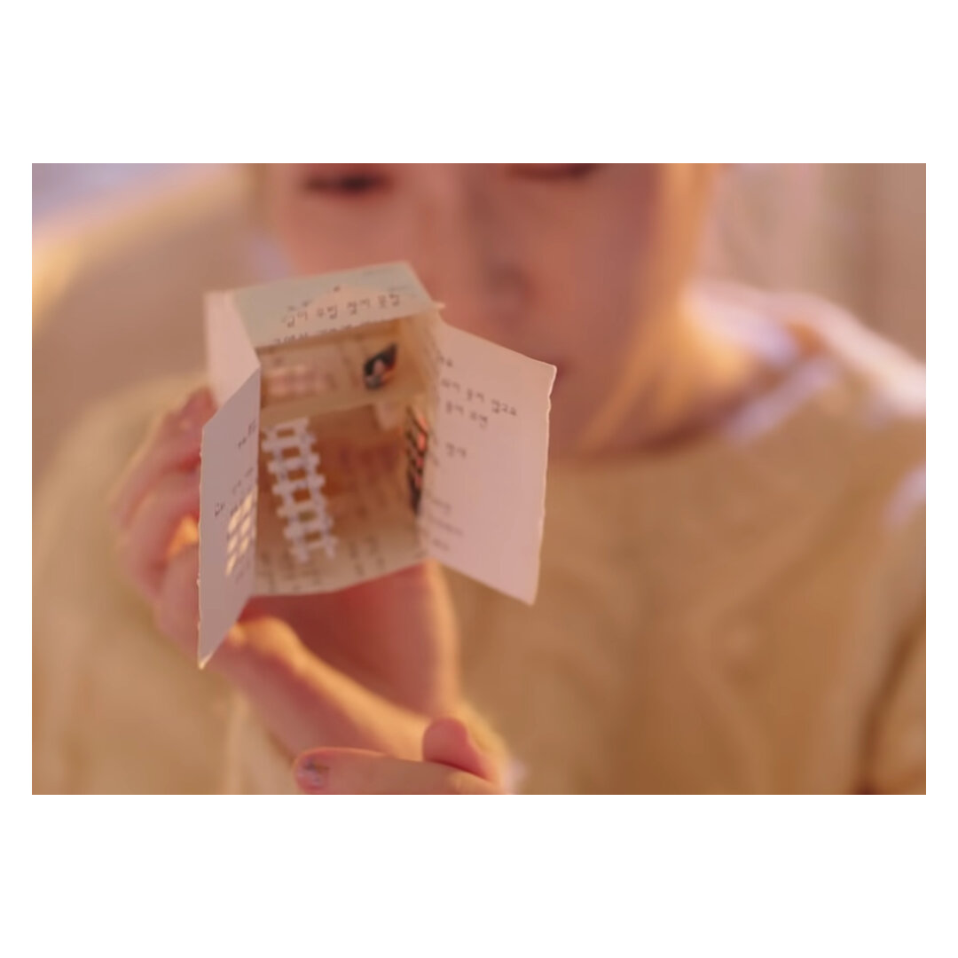
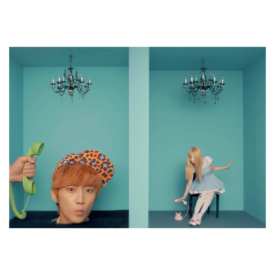
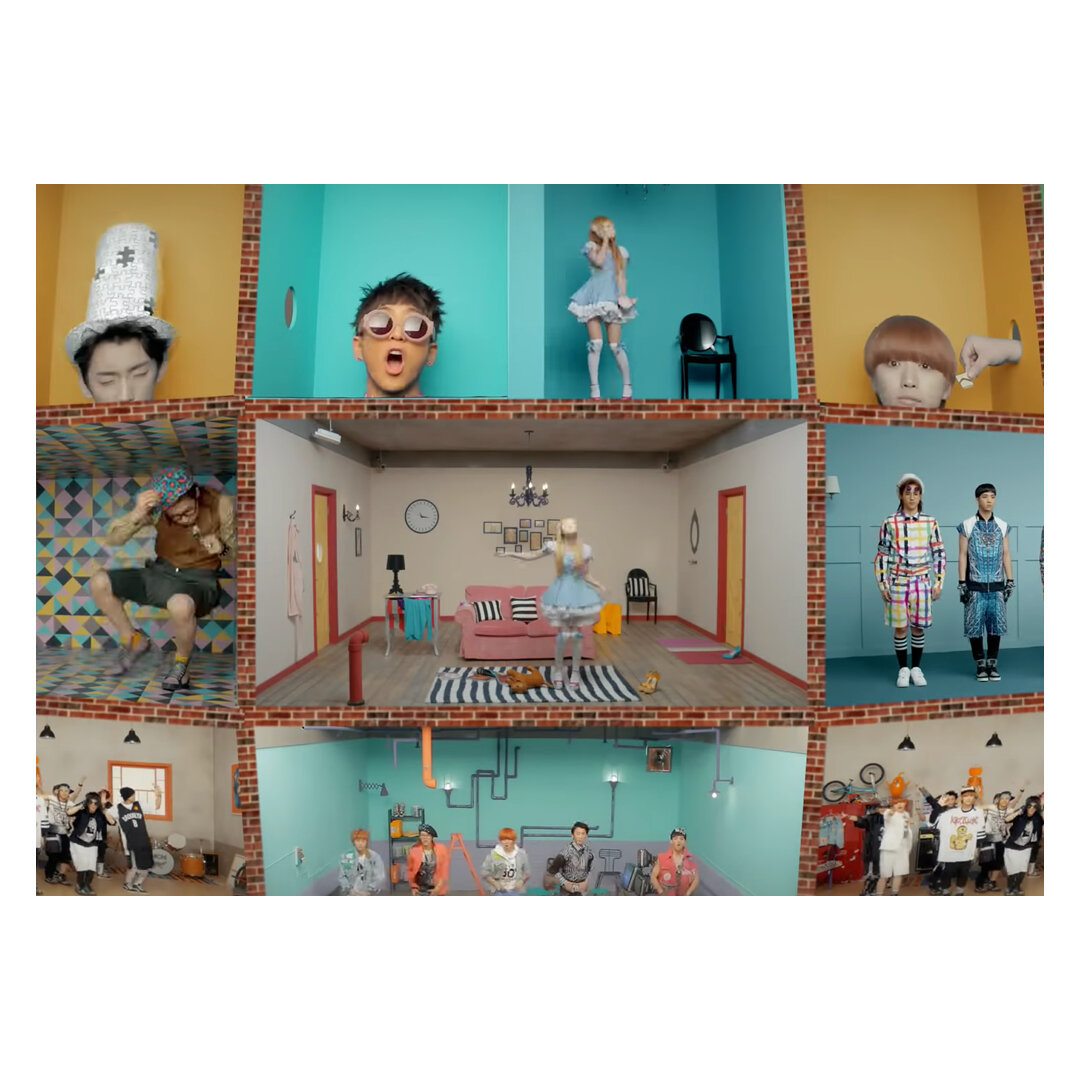
The house or home is one of my favourite tropes in the music video world because of their shifting identities. For instance, IU’s joint narrative of You and I (2011) and Above The Time (2019), the fairy-tale-like dollhouse is a metaphor about two lovers separated by time and parallel worlds. Additionally it presented excellent opportunity for the set designers to add additional ‘Easter-eggs’ to elaborate the narrative. Although the hidden meanings would be more identifiable if the videos were watched simultaneously and in order. Perhaps then, it would be fitting to argue that the combination of time and staging has also greatly influenced the depth of the story.
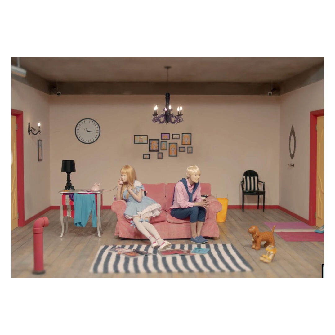
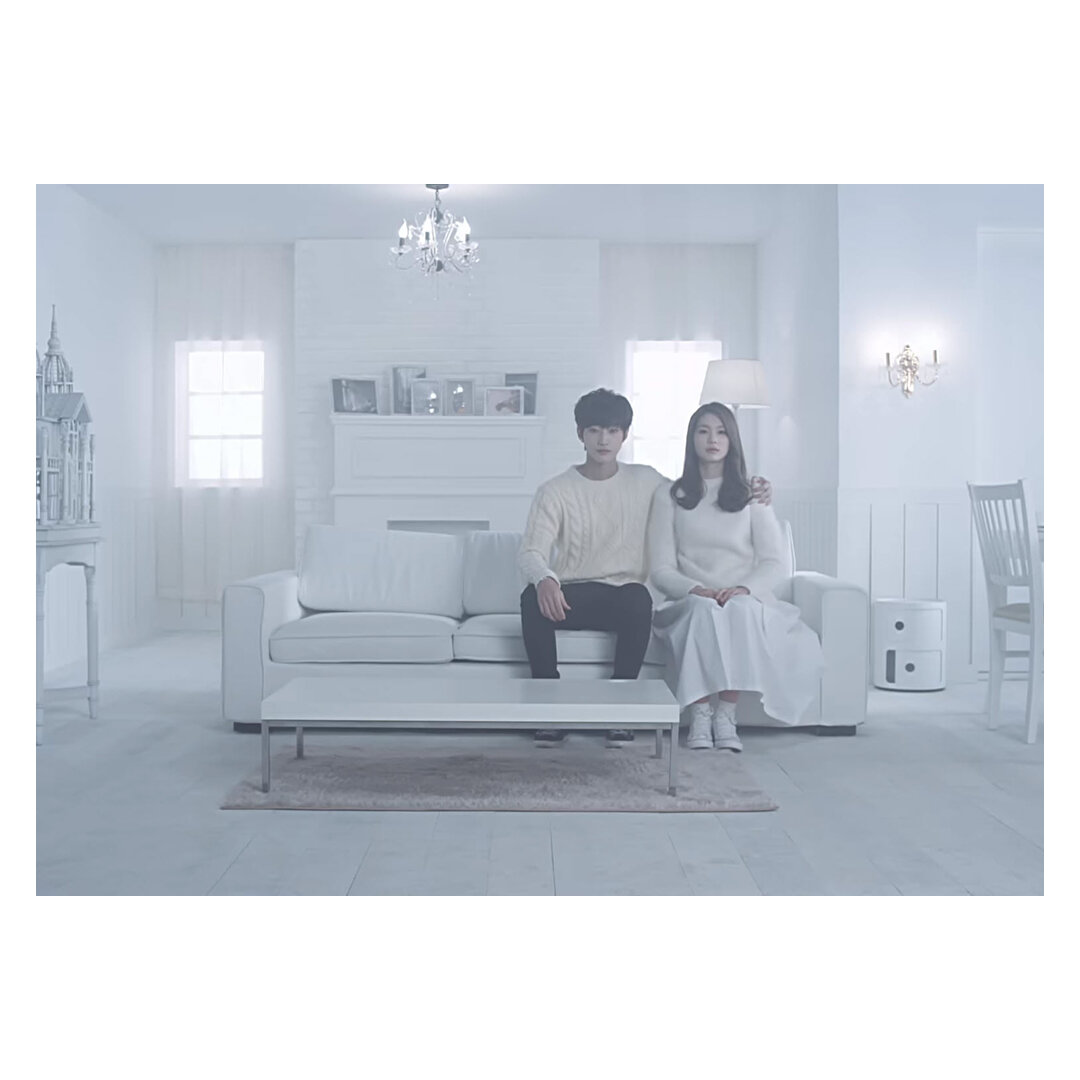
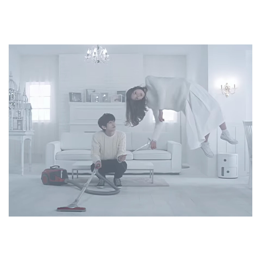
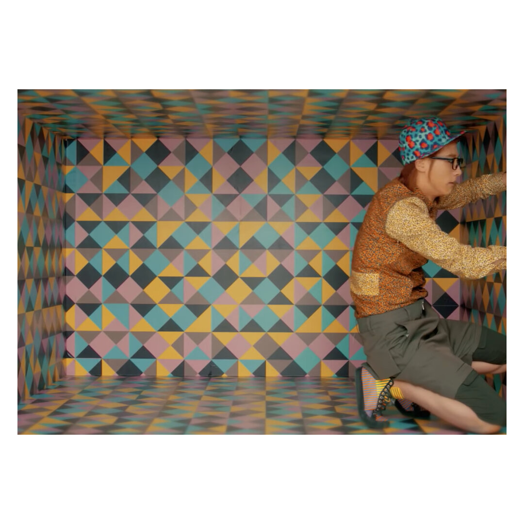
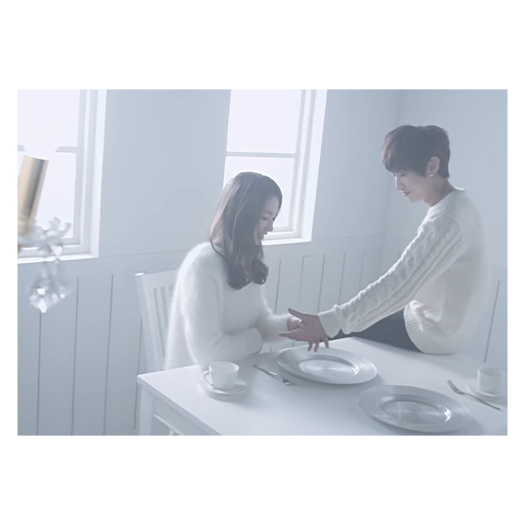
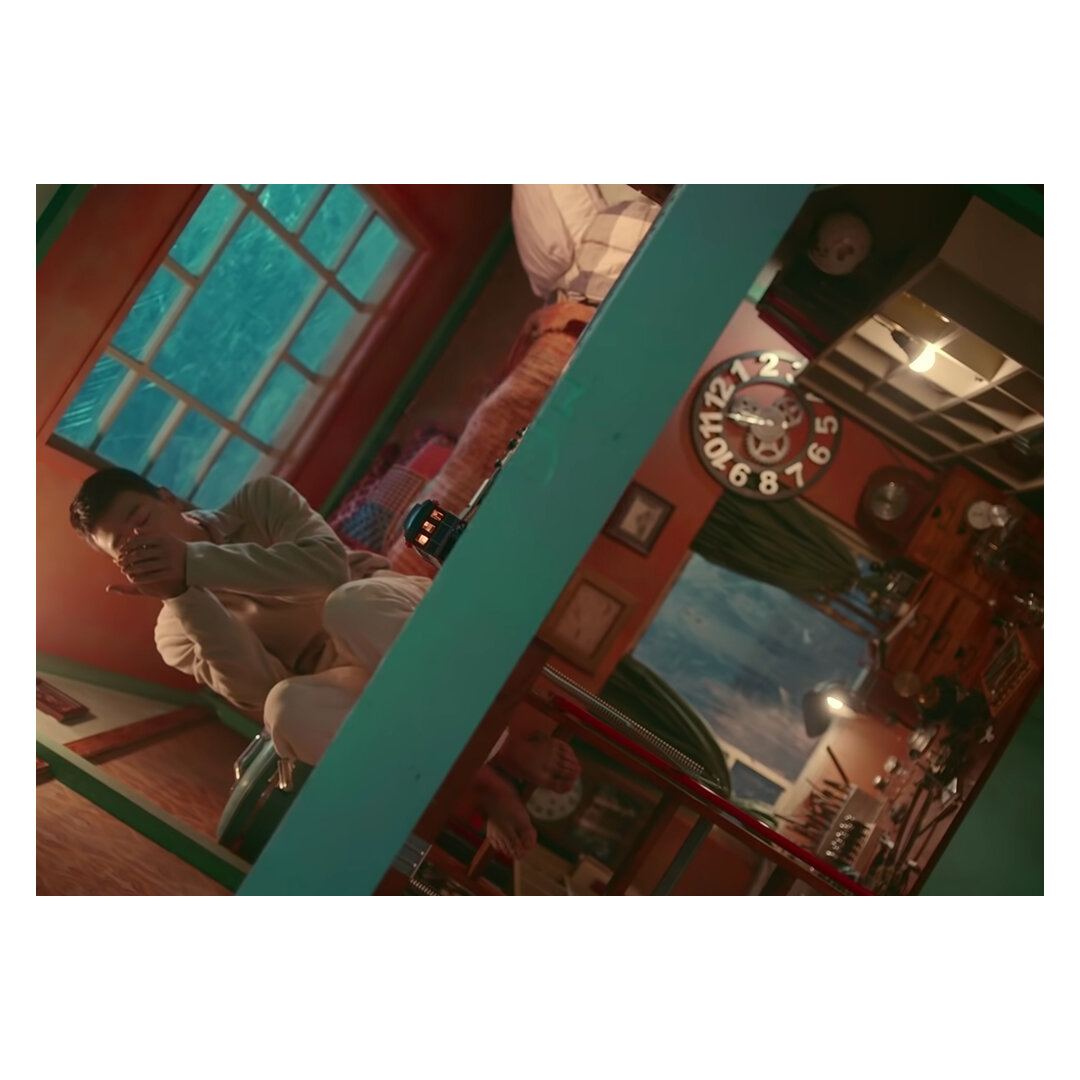
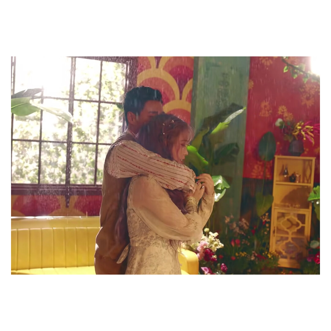
Carrying similar sentiments are B1A4’s storylines, where the architecture is elemental to framing innuendos. Like IU’s dollhouse representing the ‘what if’s’ of a romance, the house in What’s Happening (2013), is a sarcastic ridicule of an unfaithful lover. The song sounds lighthearted, but squeezing the singers into a small ‘room’ of the dollhouse - reveals an innuendo about confronting cheating in relationships - suffocating. On the contrary, their ballad Lonely (2014) uses the house as the illusion of a non-existent relationship, everything is doused in white and grey, waiting and ready for the protagonist to leave it behind. If we look at them together, it would be safe to say that the ‘house’ often plays a pivotal role in the narrative.
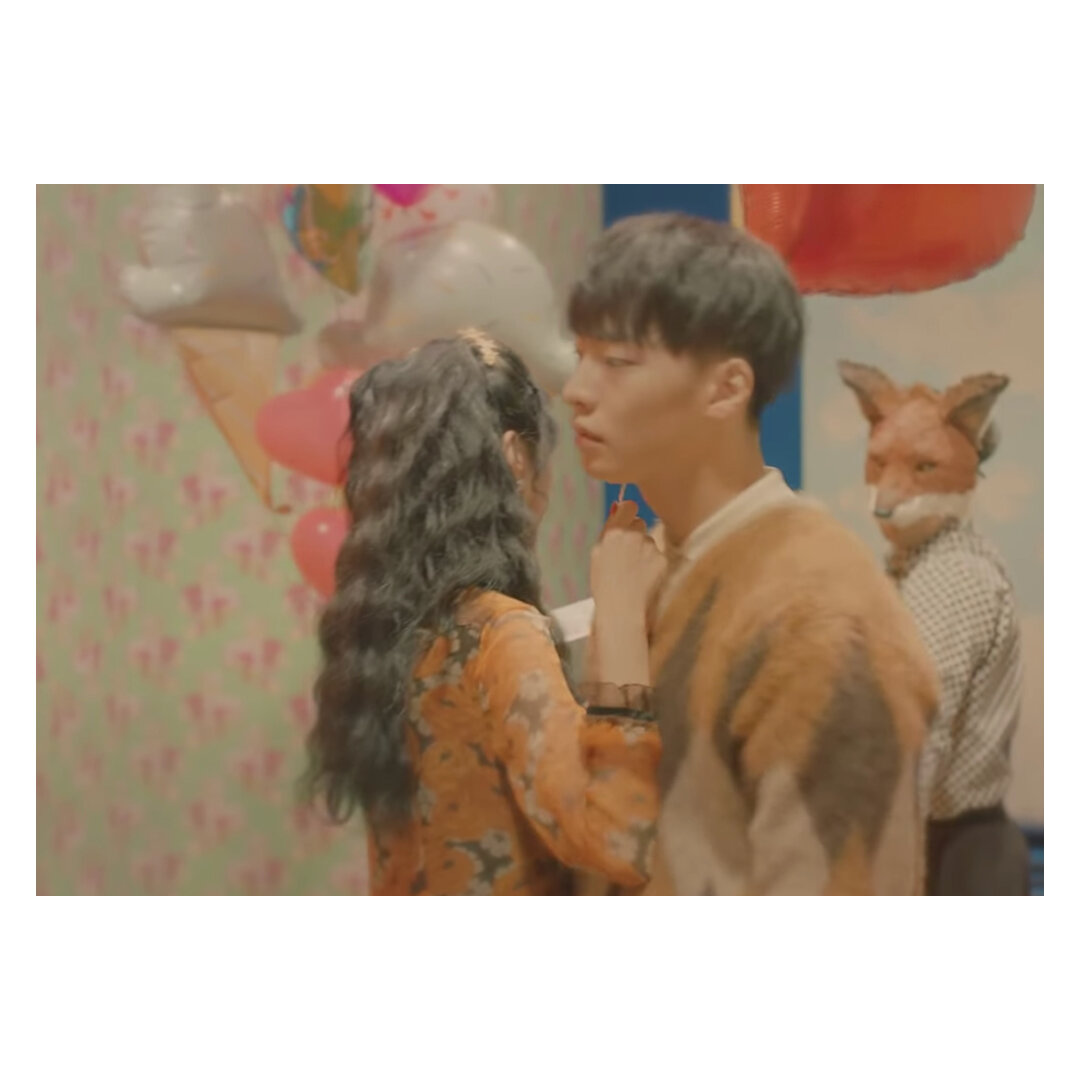
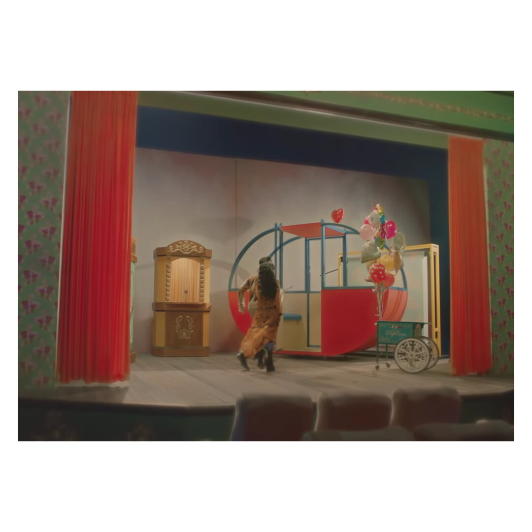
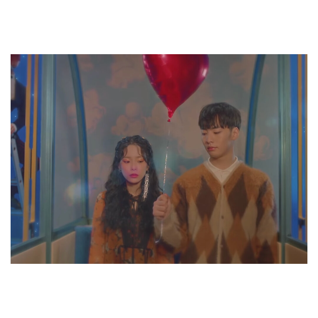
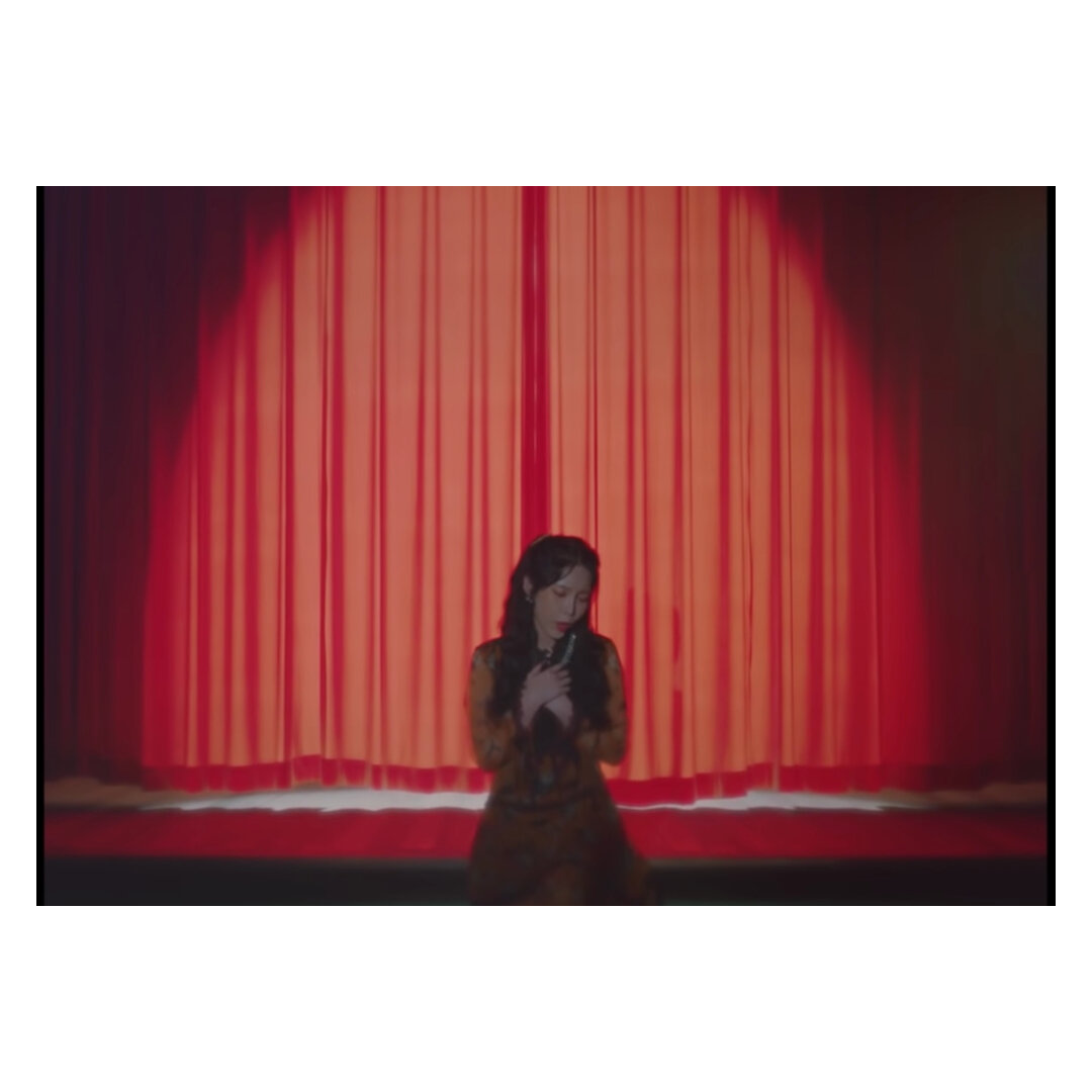
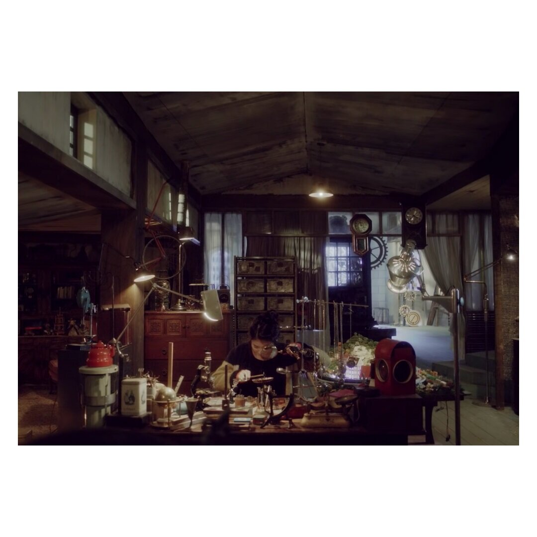
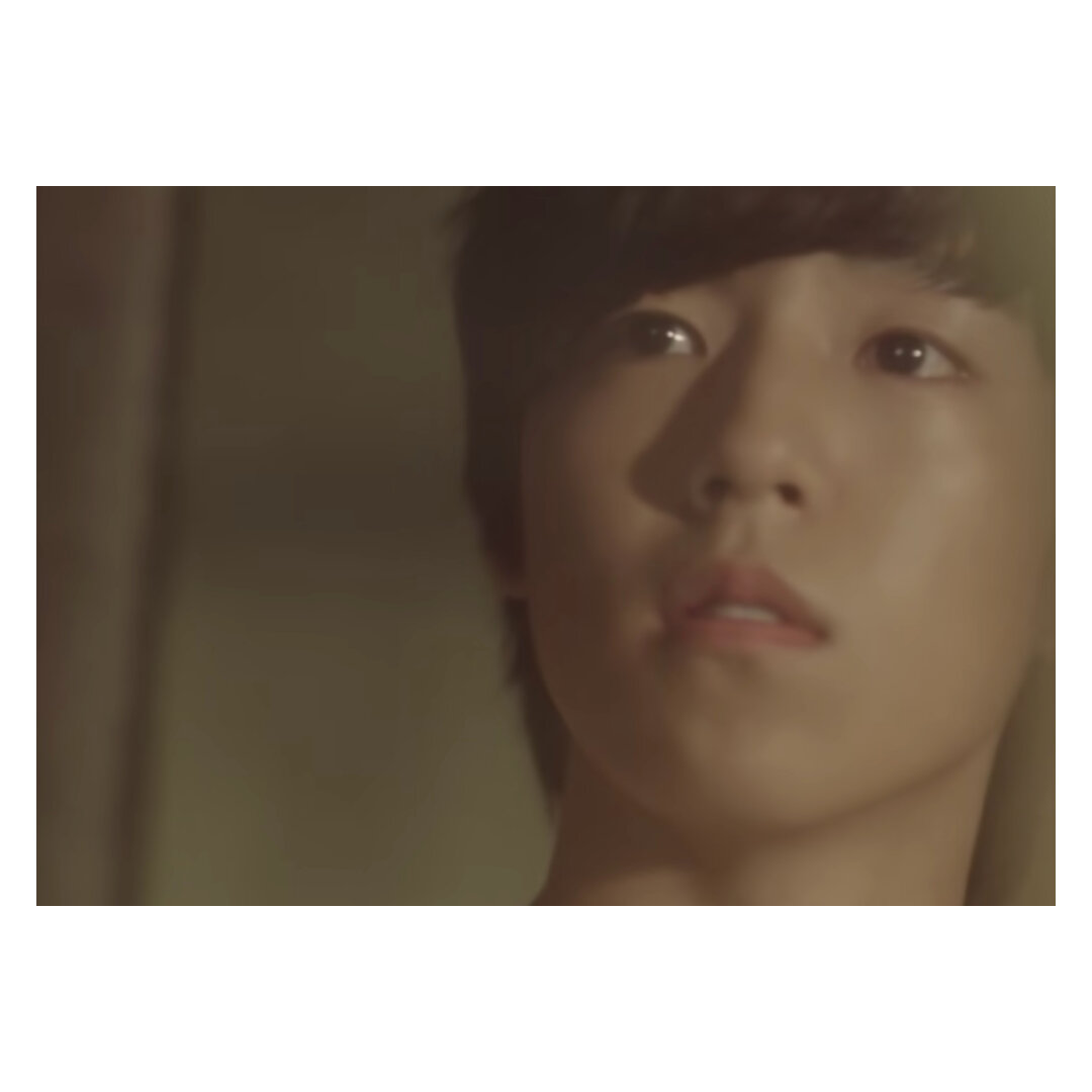
However, if I were to say which is my favourite video for stage setting - it would have to be Heize’s No Reason (2019) She’s one of my favourite artists - but, No Reason tops off as one of the sweetest videos I’ve seen. It’s a simple love story of a couple chasing after a balloon in a carnival. On paper, it sounds boring, but when watching it, it’s almost as if they’ve designed the video to make it almost like a high school production. And because they transformed a collection of simple props into an effective storytelling mechanism, I can’t help but watch it over and over again.
3. I watch it because of the choreography and backdrop…
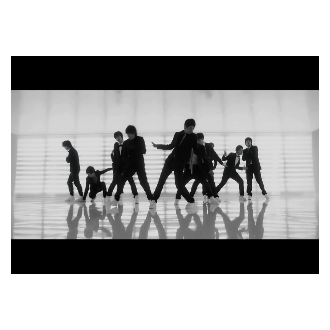
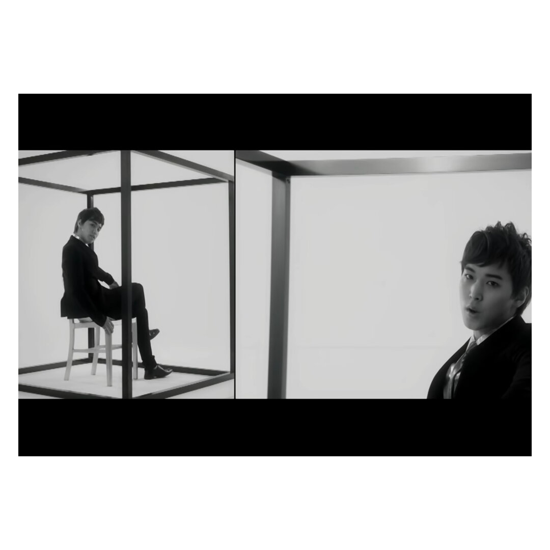
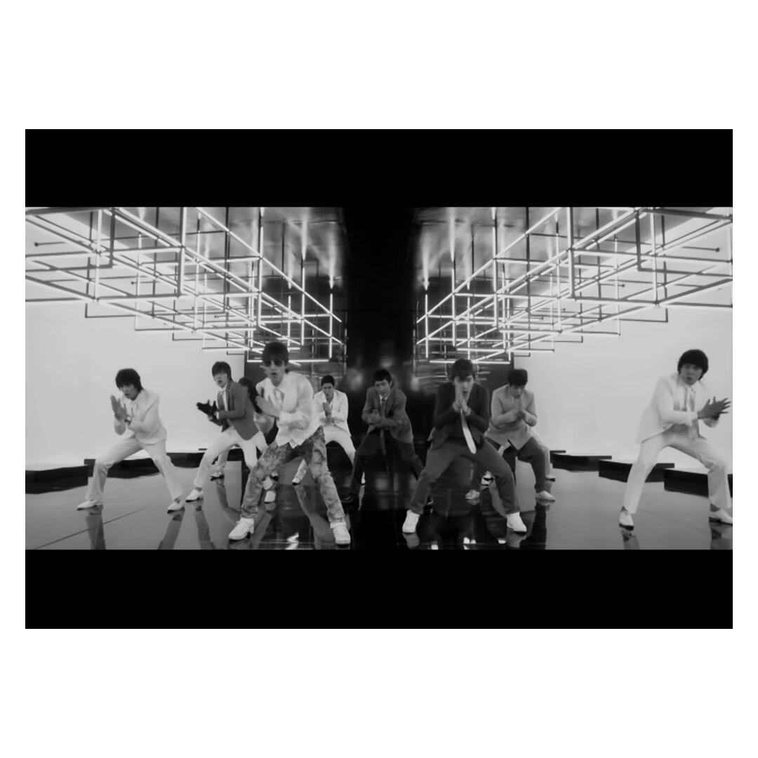
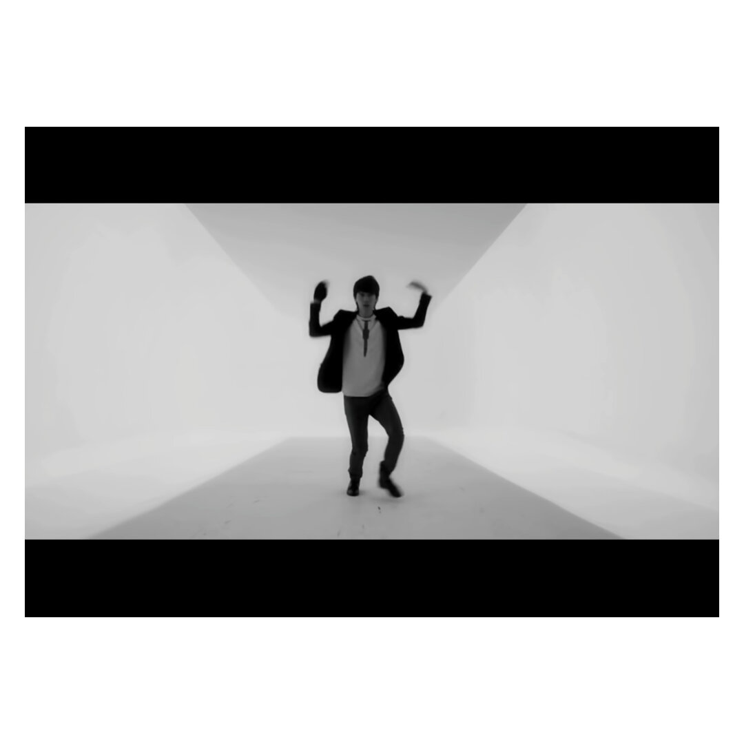
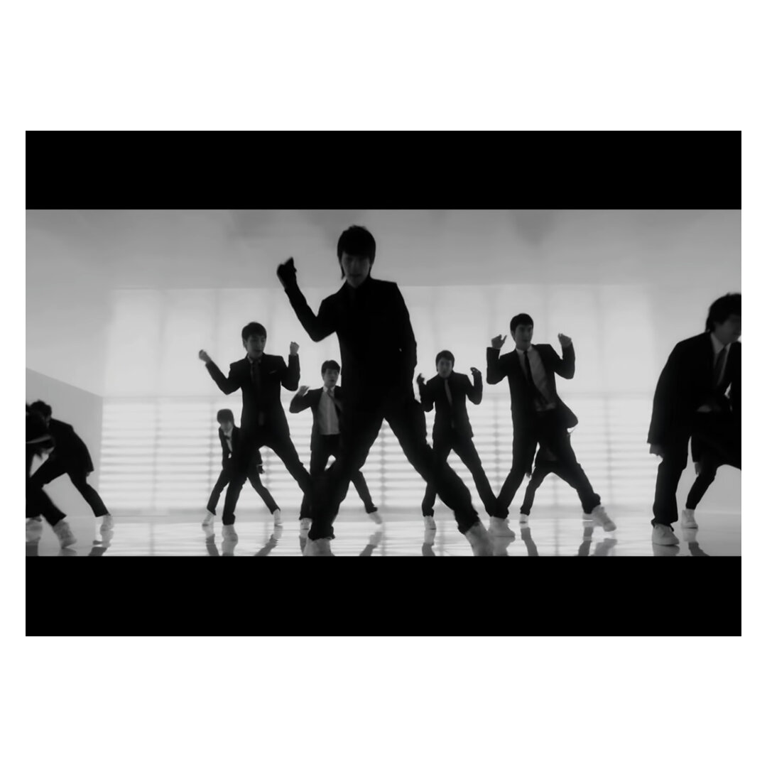
Personally, the K-Pop industry burst into my radar of music video appreciation because of their complex and dancing in a large group. These groups are talented in singing and dancing, and it would be a shame to continually focus on a narrative and miss out on their years of training to become a double and triple threat. In the early years, when the Korean wave swamped our screens, videos were centred on the intricate choreography and bright backdrops. The dancers would often be placed within a ‘box’ stage, enclosed environments glamourised by big props and fluorescent lights, sprinkled with solo closeups for engagement. Looking back, Super Junior’s iconic Sorry Sorry (2009) was one of the classic videos where the box was simple but highly effective. The black and white music video was iconic for the choreography that was highlighted by a simple, sleek backdrop. Even though many fans are more inclined to the storytelling method, the strategy is still being used today. However, the box environment has become more extravagant with bigger statements, bigger moves and intense utilisation of the green screens. The dancing is impressive, but it’s even more impressive when the choreography has been enhanced by a compelling backdrop.
////////
Ultimately, K-Pop music videos are addictive to watch because of the aesthetics and the ensemble of effort that led to a masterpiece. Even if the video is ridiculous, a colour explosion, or because the dance looks exciting to learn - it still gives me a place to retreat from the busy environment.
Although, it does sort of help that the singers and actors are aesthetically pleasing to look at…
Music Videos Mentioned (In Order)
*List of my favourite videos (mentioned and not mentioned) - you can find them here
Red Velvet. “Red Velvet 레드벨벳 'Dumb Dumb' MV” SMTOWN, September 08, 2015. YouTube video, 3:22 https://www.youtube.com/watch?v=XGdbaEDVWp0
SHINee. “SHINee 샤이니 '셀 수 없는 (Countless)' MV” SMTOWN, September 10, 2018. YouTube video, 3:28 https://www.youtube.com/watch?v=6lE0AJzOb-I
BiBi. “[MV] BIBI(비비) _ Restless(신경쓰여) (LISTEN 035)” 1theK (원더케이), February 02, 2020. YouTube video, 4:27 https://www.youtube.com/watch?v=se4Xsgb0qGk
IU. “IU(아이유) _ YOU&I(너랑나) MV” 1theK (원더케이), November 29, 2011. YouTube video, 8:53 https://www.youtube.com/watch?v=f_iQRO5BdCM
IU. “[MV] IU(아이유) _ above the time(시간의 바깥)” 1theK (원더케이), November 18, 2019. YouTube video, 5:15 https://www.youtube.com/watch?v=R3Fwdnij49o
B1A4. “[MV] IU(아이유) _ above the time(시간의 바깥)” B1A4 OFFICIAL+, May 7, 2013. YouTube video, 3:22 https://www.youtube.com/watch?v=oqxHy4G9FMI
B1A4. “B1A4 - Lonely (없구나) (Full ver.)” B1A4 OFFICIAL+, January 13, 2014. YouTube video, 4:13 https://www.youtube.com/watch?v=CoObTyYr814
Heize. “헤이즈 (Heize) - 이유 (No Reason) M/V” Stone Music Entertainment, March 28, 2019. YouTube video, 3:42 https://www.youtube.com/watch?v=l5i8YoFBvO4
Super Junior. “SUPER JUNIOR 슈퍼주니어 '쏘리 쏘리 (SORRY, SORRY)' MV” SMTOWN, June 8, 2009. YouTube video, 4:12 https://www.youtube.com/watch?v=x6QA3m58DQw
Reference:
Kelley, Caitlin. How SM Entertainment’s ‘Box Format Defined an Era of K-Pop Music Videos. Billboard.com. 26 July, 2018. https://www.billboard.com/articles/columns/k-town/8467257/kpop-music-videos-the-box-sm-entertainment
Kilenaitor. [Writeup] The SM “Box” MV. Reddit. Posted 2017. https://www.reddit.com/r/kpop/comments/50437y/writeup_the_sm_box_mv/
Author unknown. K-pop MV Sets: Your Favourite Boxes. Seoulbeats.com. 15 June, 2012. https://seoulbeats.com/2012/06/k-pop-mv-sets-your-favourite-boxes/